ChartGen
Transforms CSV and Excel data into professional charts using plain English descriptions.
Are you the owner?
Claim this tool to publish updates, news and respond to users.
Sign in to claim ownership
Sign InDescription
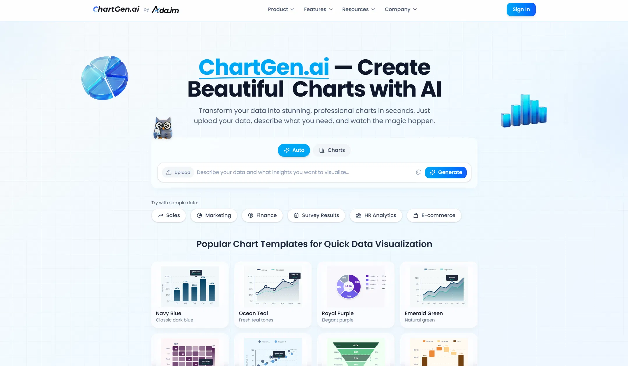
ChartGen.ai is a specialized AI tool designed to streamline the process of data visualization, created to serve professionals who need to quickly convert raw data into clear, actionable insights. Its core value lies in eliminating the technical complexity typically associated with chart creation, allowing users to focus on analysis and storytelling rather than software mechanics. By leveraging artificial intelligence, it interprets user intent from natural language, making advanced data visualization accessible to a broader audience without requiring expertise in tools like Excel or programming libraries.
Key features include the ability to upload data directly from CSV and Excel files, describe the desired visualization in plain English, and receive automatically generated charts. The platform supports a wide range of chart types, from basic bar and line graphs to more complex scatter plots and heatmaps. It offers customization options for colors, labels, and layouts to ensure the output meets professional standards. The workflow is designed for efficiency, enabling rapid iteration and refinement of visualizations based on user feedback.
What sets ChartGen.ai apart is its focus on a purely descriptive, code-free interface that understands contextual data relationships. The underlying AI model is trained to suggest the most appropriate chart type based on the data structure and the user's stated goal, such as comparing trends or showing distributions. It operates as a web application, ensuring cross-platform accessibility without any software installation. While primarily a standalone tool, its output can be easily downloaded in common image formats for integration into reports, presentations, or dashboards.
Ideal for business analysts, marketers, researchers, and educators who regularly work with data but may lack deep technical design skills. Specific use cases include creating quarterly sales performance dashboards from spreadsheet exports, visualizing survey results for a presentation, generating educational materials for a classroom, or quickly prototyping charts for a report. It is particularly valuable for individuals and small teams that need to produce polished, professional visualizations under time constraints without investing in complex software training.